Donut charts display percentage data in a semi-circle, much like a pie chart with the center removed.
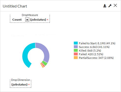
Drop Measure
By default, the Drop Measure will show a count of the field that you selected for the Drop Dimension. You can graph something other than the default, such as the number of failed objects.
Drop Dimension
In a donut chart, the dimension can include alphabetic information, such as a job status or agent name.
General Properties
In the Report Builder, on the Properties tab, on the General  tab, you can configure settings for a donut chart.
Chart Title
Allows you to specify the name of the chart.
ID
By default, displays the automatically-generated identifier for the chart. You can specify a different chart ID.
Data Set
Displays the data set used to create the chart. This box is not editable.
Chart Type
By default, displays the type of chart you chose to create. You can change the chart type by selecting another type from the list.
Show as 3D
When selected, displays the bars as three-dimensional, and at the same time, on the General tab, displays the 3D Options section.
When cleared, displays the bars as two-dimensional, and also hides the 3D Options section.
3D Options
This section appears when you select Show as 3D and contains settings for 3D bars in a chart.
-
3D Vertical Angle
In this box, you can configure the bars to display at a specific vertical angle, such as 25 degrees.
-
3D Depth
Show Data Labels
When selected, displays the value associated with each donut piece. When cleared, hides the value associated with each donut piece.
Show Legend
When selected, this option displays a legend in the chart, and at the same time, on the General tab, displays the Max Legend Label Length and Legend Position options.
When cleared, this option hides the legend from the chart and also hides the additional legend options on the General tab.
-
Legend Position
In this list, you can configure the placement of the legend in the chart. The legend can appear at the Top, Bottom, Right or Left of the bars.
-
Max Legend Label Length
In this box, you can configure the maximum number of characters that are allowed to appear in the legend labels.
Show in Tabular Form
When selected, this option converts the chart to a table. When cleared, this option converts the table to a chart.
Disable Interactivity
To disable all interactive elements in the component, move the toggle key to the right.
Hide Header
To hide header information in the component output, select this option.
Start Angle
Allows you to configure the starting angle for left side of the donut.
End Angle
Allows you to configure the ending angle for the right side of the donut.
Inner Width (%)
Allows you to configure the size of the hole in the center of the donut.
-
Visible: Select who can view the component.
-
All: To allow everyone see the component, select this option.
-
CommCell Admin: To allow only CommCell administrators see the component, select this option.
-
Tenant Admin: To allow only only tenant administrators see the component, select this option.
-
Custom: To allow users see the component based on the permissions, select this option, then in the Visible Expression box, enter a JavaScript statement.
For example, to allow MSP users view the component, in the Visible Expression box, enter := return cv.isMspUser.
-
Field Properties
Start Angle
Allows you to configure the starting angle for left side of the donut.
End Angle
Allows you to configure the ending angle for the right side of the donut.
Inner Width (%)
Allows you to configure the size of the hole in the center of the donut.
Sorting
Sort By
Allows you to sort the data by the Drop Dimension (X-Axis) or Drop Measure (Y-Axis) values.
Sort Order
Allows you to sort data in ascending or descending order.
Measure
To configure settings in Formatter under Measure or Dimension, see Formatting Data in Components for Build Your Own Reports.
Auto convert values
When selected, automatically converts display sizes for labels. For example, 10,000 KB is converted to 10 MB.
Count (Y-Axis Label)
-
Aggregate
Allows you to specify the type of numeric value to display in the chart.
-
Formatter
Dimension
X-Axis Label
When selected, you can configure the data points that appear in the chart.
- Max Points
Allows you to specify the maximum number of data points that will appear in the chart.
-
All Points
When selected, displays all data points. When cleared, the Max Points setting controls the number of data points that appear in the chart.
-
Formatter
Custom Colors
To configure a color for each x-axis data point, click Customize Series Colors  , select an x-axis data point from the list, and then select a color from the Color dialog box.
To delete the custom color, click the trash icon  next to the x-axis data point.
Any bar that is not configured with a custom color displays the color that is configured in the Default Color box.
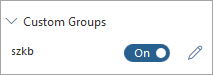
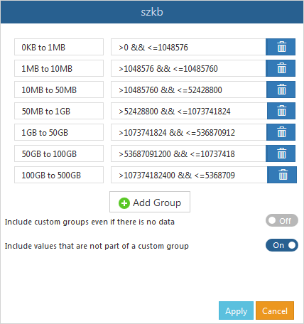
Custom Groups
To configure settings under Custom Group, see Configuring Custom Groups in Charts.
Field Name Option
When selected, enables the custom group settings you configured.
Field Name Dialog Box
Allows you to specify a set of custom bars based on a formula that you enter. Select a field name, and then click Edit  to open this dialog box.
Custom Code Properties
In the Report Builder, on the Properties tab, on the Custom Code  tab, you can configure settings for a donut chart.
Start Angle
Allows you to configure the starting angle for left side of the donut.
End Angle
Allows you to configure the ending angle for the right side of the donut.
Inner Width (%)
Allows you to configure the size of the hole in the center of the donut.
On Click
Allows you to configure an action on a bar or the entire chart using JavaScript.
-
Run a workflow: From the list, select a workflow that runs.
-
Open Report: From the list, select a report that opens.
-
Url: In the box, you can enter a URL that opens a web page.
-
Custom: In the Expression box, enter a JavaScript expression.
-
Add Table Record:
-
Edit Table Records:
To configure settings under Custom Code, see Configuring Custom Code and Custom Styles for Reports.