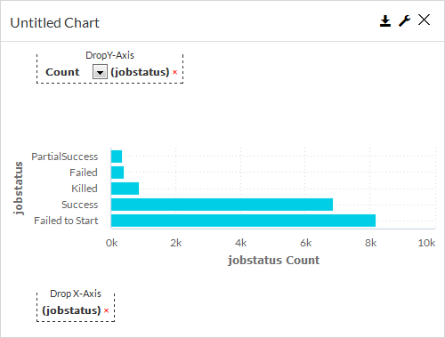
Horizontal bar charts display data in a series of bars that run from left to right. Horizontal bar graphs use the y-axis for labeling categories, while numeric data is measured along the x-axis. This type of chart is useful if the label text for categories is particularly long.
Drop Y-Axis
In a horizontal bar chart, the y-axis includes numeric information, such as the number of client computers or jobs in each status.
Drop X-Axis
In a horizontal bar chart, the x-axis includes text-based information, such as client computer names or job statuses.
General Properties
In the Report Builder, on the Properties tab, on the General  tab, you can configure settings for a horizontal bar chart.
Chart Title
In this box, you can specify the title that appears in the chart label.
ID
By default, displays the automatically-generated identifier for the chart. You can specify a different chart ID.
Data Set
Displays the data set used to create the chart. You cannot edit the contents of this box.
Y-Axis Title
Displays the data set used to create the chart. You cannot edit the contents of this box.
X-Axis Title
In this box, you can specify the label for x-axis data that runs vertically up the side of the chart.
Chart Type
In this box, you can change the chart type by selecting another type from the list, such as Vertical Bar or Pie.
By default, this box displays the type of chart you chose from the Visualization tab.
Show as 3D
When selected, displays the bars as three-dimensional, and at the same time, on the General tab, displays the 3D Options section.
When cleared, displays the bars as two-dimensional, and also hides the 3D Options section.
3D Options
This section appears when you select Show as 3D and contains settings for 3D bars in a chart.
-
3D Stacking
This option displays the bars in a stacking format.
-
3D Vertical Angle
In this box, you can configure the bars to display at a specific vertical angle, such as 25 degrees.
-
3D Horizontal Angle
In this box, you can configure the bars to display at a specific horizontal angle, such as 15 degrees.
-
3D Depth
-
3D Column Padding
In this box, you can specify the amount of padding that displays around the bar, such as 30 pixels.
Show Gridlines
hen selected, this option displays the grid lines in the chart. When cleared, this option hides the grid lines in the chart.
Toggle Chart
When selected, this option converts the x-axis data into descending order. When cleared, this option converts the x-axis data to ascending order.
Show Data Labels
When selected, this option displays the value associated with each bar. When cleared, this option hides the value associated with each bar.
Show Legend
When selected, this option displays a legend in the chart, and at the same time, on the General tab, displays the Max Legend Label Length and Legend Position options.
When cleared, this option hides the legend from the chart and also hides the additional legend options on the General tab.
-
Legend Position
In this list, you can configure the placement of the legend in the chart. The legend can appear at the Top, Bottom, Right or Left of the bars.
-
Max Legend Label Length
In this box, you can configure the maximum number of characters that are allowed to appear in the legend labels.
Show in Tabular Form
When selected, this option converts the chart to a table. When cleared, this option converts the table to a chart.
Disable Interactivity
To disable the interactive elements in this component, move the toggle key to the right.
Hide Header
To hide header information from the chart output, select this option.
-
Visible: Select who can view the component.
-
All: To allow everyone see the component, select this option.
-
CommCell Admin: To allow only CommCell administrators see the component, select this option.
-
Tenant Admin: To allow only only tenant administrators see the component, select this option.
-
Custom: To allow users see the component based on the permissions, select this option, then in the Visible Expression box, enter a JavaScript statement.
For example, to allow MSP users view the component, in the Visible Expression box, enter := return cv.isMspUser.
-
Field Properties
In the Report Builder, on the Properties tab, on the Fields  tab, you can configure settings for a horizontal bar chart.
Sorting
Sort By
Allows you to sort the data by the X-Axis or Y-Axis values.
Sort Order
Allows you to sort data in ascending or descending order.
Measure
To configure settings in Formatter under Measure or Dimension, see Formatting Data in Components for Build Your Own Reports.
Auto convert values
When selected, automatically converts display sizes for labels. For example, 10,000 KB is converted to 10 MB.
Count (Y-Axis Label)
-
Aggregate
Allows you to specify the type of numeric value to display in the bars, such as Distinct or Avg.
-
Formatter
Dimension
Slant X-Axis Labels
When selected, this option displays x-axis labels at a slanted angle and allows you to specify the degree of the angle.
When cleared, displays x-axis labels horizontally.
If there are over five labels, then labels will automatically display as slanted.
-
Angle
Allows you to specify the degree of the angle.
X-Axis Label
When selected, you can configure the data points that appear in the chart.
-
Max Points
Allows you to specify the maximum number of data points that will appear in the chart.
-
All Points
When selected, displays all data points. When cleared, the Max Points setting controls the number of data points that appear in the chart.
-
Formatter
Custom Colors
To configure a color for each x-axis data point, click Customize Series Colors  , select an x-axis data point from the list, and then select a color from the Color dialog box.
To delete the custom color, click the trash icon  next to the x-axis data point.
Any bar that is not configured with a custom color displays the color that is configured in the Default Color box.
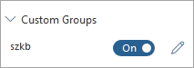
Custom Groups
To configure settings under Custom Group, see Configuring Custom Groups in Charts.
Field Name Option
When selected, enables the custom group settings you configured.
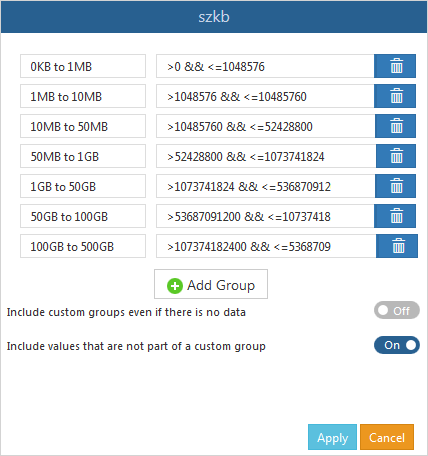
Field Name Dialog Box
Allows you to specify a set of custom bars based on a formula that you enter. Select a field name, and then click Edit  to open the dialog box.
Custom Code Properties
In the Report Builder, on the Properties tab, on the Custom Code  tab, you can configure settings for a horizontal bar chart.
On Click
Allows you to configure an action on a bar or the entire chart. Options include any of the following:
-
Run a workflow: From the list, select a workflow that runs.
-
Open Report: From the list, select a report that opens.
-
Url: In the box, you can enter a URL that opens a web page.
-
Custom: In the Expression box, enter a JavaScript expression.
-
Add Table Record:
-
Edit Table Records:
To configure settings under Custom Code, see Configuring Custom Code and Custom Styles for Reports.