Timeline charts display changes in data over time. Information appears in a series of data points that are connected by lines. This type of chart is useful for displaying information that changes continuously. You can configure any of the following options to customize the way data appears in the chart.
Options in the Component
-
Drop Y-Axis: In a line chart, the y-axis can include both text-based or numeric categories, such as job statuses or total backup size.
-
Drop X-Axis: In a line chart, the x-axis includes numeric information, such as the start time for a job.
General
-
Chart Title: Allows you to specify the name of the chart.
-
ID: By default, displays the automatically-generated identifier for the chart. You can specify a different chart ID.
-
Data Set: Displays the data set used to create the chart. This box is not editable.
-
Y-Axis Title: Allows you to specify the label for y-axis data that runs horizontally across the bottom of the chart.
-
X-Axis Title: Allows you to specify the label for x-axis data that runs vertically up the side of the chart.
-
Chart Type: By default, displays the type of chart you chose to create. You can change the chart type by selecting another type from the list.
-
Show Gridlines: When selected, shows the gridlines in the chart. When cleared, hides the gridlines in the chart.
-
Smooth Lines: When selected, displays curved lines instead of straight lines. When cleared displays straight lines.
-
Show Area: When selected, highlights the area covered by the line.
-
Skip line for missing data: When selected, a graph line connects across null points, or renders a gap between the two points on either side of the null.
-
Show Markers: When selected, displays a dot for each data point. When cleared, hides the dot for each data point.
-
Show Data Labels: When selected, displays the value associated with each data point. When cleared, hides the value associated with each data point.
-
Show Legend: When selected, displays a legend for the chart information and the Max Legend Label Length and Legend Position settings. When cleared, hides Legend information and settings.
-
Legend Position: Allows you to configure the placement of the legend in the chart. Can be Top, Bottom, Right or Left.
-
Max Legend Label Length: Allows you to configure the maximum number of characters in legend labels.
-
-
Show in Tabular Form: When selected, this option converts the chart to a table. When cleared, this option converts the table to a chart.
-
Disable Interactivity: To disable the interactive elements in this component, move the toggle key to the right.
Interactivity allows the user to narrow the view of the data to a smaller time period, such as down to an hour, or even a series of seconds. To return to the default view of data, in the component, click Clear.
-
Hide Header: To hide header information from the chart output, select this option.
-
Show top right tooltip: To display the tool tip in the top-right area of the component, move this toggle key to the right.
-
Visible: Select who can view the component.
-
All: To allow everyone see the component, select this option.
-
CommCell Admin: To allow only CommCell administrators see the component, select this option.
-
Tenant Admin: To allow only only tenant administrators see the component, select this option.
-
Custom: To allow users see the component based on the permissions, select this option, then in the Visible Expression box, enter a JavaScript statement.
For example, to allow MSP users view the component, in the Visible Expression box, enter := return cv.isMspUser.
-
Fields
-
Visible: Select who can view the component.
-
All: To allow everyone see the component, select this option.
-
CommCell Admin: To allow only CommCell administrators see the component, select this option.
-
Tenant Admin: To allow only only tenant administrators see the component, select this option.
-
Custom: To allow users see the component based on the permissions, select this option, then in the Visible Expression box, enter a JavaScript statement.
For example, to allow MSP users view the component, in the Visible Expression box, enter := return cv.isMspUser.
-
-
Sorting: To configure sorting options, click this option.
-
Sort By: Data can only be sorted by the x-axis values. This setting is not editable.
-
Sort Order: To sort data in ascending or descending order, select Asc or Desc.
-
-
Measure: To configure options for the X-axis and Y-axis data points, select this option.
-
Auto convert values: To automatically convert display sizes for data points, move this toggle key to the right. For example, 10,000 KB is converted to 10 MB.
-
Y-Axis: To configure options for the Y-axis data, click this option.
-
Legend Label: To display a custom label for the data, enter a label.
-
Aggregate: To specify the type of numeric value that appears for the data points, select Count or Distinct.
-
-
-
Dimension: To configure options for X-axis data points, click this option. For timeline charts, the following options appear only when you add multiple X-axis data types to the component.
-
Slant X-Axis: To display data point labels at a slanted angle, move this toggle key to the right, and then in the box, specify the degree of the angle. If there are more than 5 labels in the component, then the labels are automatically slanted.
-
X-axis data: To configure options for this type of X-axis data, select this option.
-
Max Points: To specify the maximum number of data points that appear for this data type, in the box, enter a number.
-
All Points: To display all data points in the component, move this toggle key to the right.
-
Formatter: To configure how this type of data appears in the component, click None. The Formatter dialog box appears.
-
-
-
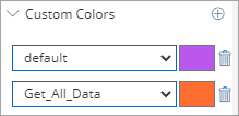
Custom Colors: To configure a color for each data point, click this option.
-
Customize Series Colors
 : To add a custom color for a data point in the component, click this button.
 A list box and color box appear. In the list, select or type a data point, and then click the color box beside it.
-
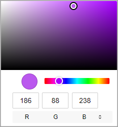
Color dialog box: Select a color or enter an RGB, a HSL, or a hex code to specify a color.
-
-
Default: To specify the default color for all data points, from the list, select default, click the color box, and then select a color. Any data point in the component that is not configured with a custom color displays the color configured for the default data point.
-
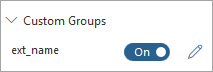
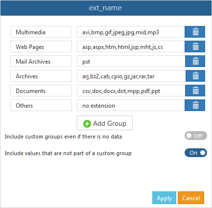
Custom Groups
You can create custom data points based on the data in each field in the chart. This option is available only for the x-axis fields. You cannot customize the time data in the y-axis.
Field Name Option
When selected, enables the custom group settings you configured.
Field Name Dialog Box
Allows you to specify a set of custom data points based on the text or formula that you enter. You can use regular expressions to define the content. Select a field name, and then click Edit to open this dialog box.
Custom Code
On Click
Allows you to configure an action on a bar or the entire chart using JavaScript.
Customize Legend Labels
Allows you to configure an action on the legend labels using JavaScript.
Filters
Example
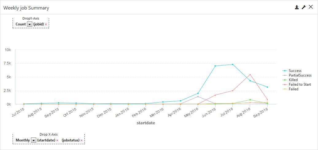
This image is an example of a timeline chart in the report builder: