HTML components use fields from a data set and allow you to configure the way data is displayed using your own HTML code. You can completely control the look of HTML components.
Example
This image is an example of an HTML component in the report builder:
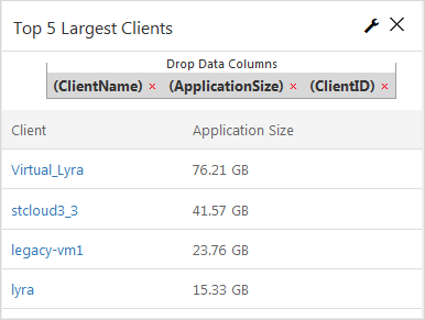
Drop Data Columns
You can use any type of field from the data set, such as client computer names or application size.
Properties
General
Chart Title
Allows you to specify the name of the component.
ID
By default, displays the automatically-generated identifier for the component. You can specify a different component ID.
Data Set
Displays the data set used to create the component. This box is not editable.
HTML Content
Allows you to write HTML code that controls the appearance and function of the component. For example:
:=
 var html="<table class=\"table\"><thead><tr><th>Client</th><th>Application Size</th></tr></thead><tbody>"
 for(var obj in rows){
 var rowObj = rows[obj];
 html = html + "<tr>"
 for(var prop in rowObj){
 if(prop === "ClientName"){
 html = html + "<td><a href='#/clientDetails/"+rowObj['ClientID']+"'>" + rowObj['ClientName']+"</a></td>"
 }else if(prop === "ApplicationSize"){
 html = html + "<td>" + rowObj[prop]+"</td>"
 }
 }
 html = html + "</tr>" ;
 }
 html = html + "</tbody></table>" ;
return html;-
Visible: Select who can view the component.
-
All: To allow everyone see the component, select this option.
-
CommCell Admin: To allow only CommCell administrators see the component, select this option.
-
Tenant Admin: To allow only only tenant administrators see the component, select this option.
-
Custom: To allow users see the component based on the permissions, select this option, then in the Visible Expression box, enter a JavaScript statement.
-
For example, to allow MSP users view the component, in the Visible Expression box, enter := return cv.isMspUser.
Field Name Sections
A section appears for each field that you added to the Drop Data Columns box and includes the following subsections.
ID
By default, displays the automatically-generated identifier for the field. You can specify a different field in this box.
Aggregate
Allows you to specify the type of numeric value to display for the field.
Delete Column
Allows you to delete the field from the Drop Data Columns box.