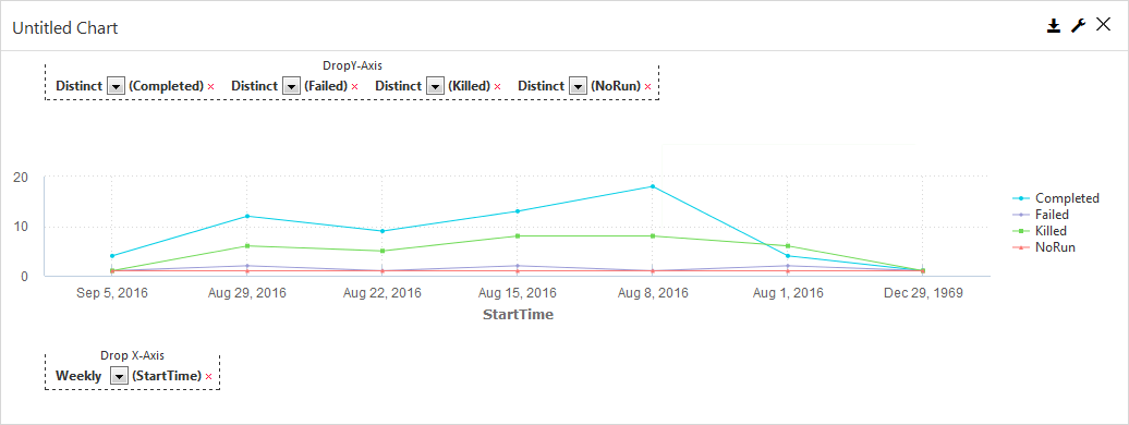
Line charts display changes in data over time. Information appears in a series of data points that are connected by lines. This type of chart is useful for displaying information that changes continuously.
Options in the Component
-
Drop Y-Axis: In a line chart, the y-axis can include both text-based or numeric categories, such as job statuses or total backup size.
-
Drop X-Axis: In a line chart, the x-axis includes numeric information, such as the start time for a job.
General
-
Chart Title: Allows you to specify the name of the chart.
-
ID: By default, displays the automatically-generated identifier for the chart. You can specify a different chart ID.
-
Data Set: Displays the data set used to create the chart. This box is not editable.
-
Y-Axis Title: Allows you to specify the label for y-axis data that runs horizontally across the bottom of the chart.
-
X-Axis Title: Allows you to specify the label for x-axis data that runs vertically up the side of the chart.
-
Chart Type: By default, displays the type of chart you chose to create. You can change the chart type by selecting another type from the list.
-
Show Gridlines: When selected, shows the gridlines in the chart. When cleared, hides the gridlines in the chart.
-
Smooth Lines: When selected, displays curved lines instead of straight lines. When cleared displays straight lines.
-
Show Area: When selected, highlights the area covered by the line.
-
Skip line for missing data: When selected, a graph line connects across null points, or renders a gap between the two points on either side of the null.
-
Show Markers: When selected, displays a dot for each data point. When cleared, hides the dot for each data point.
-
Show Data Labels: When selected, displays the value associated with each data point. When cleared, hides the value associated with each data point.
-
Show Legend: When selected, displays a legend for the chart information and the Max Legend Label Length and Legend Position settings. When cleared, hides Legend information and settings.
-
Legend Position: Allows you to configure the placement of the legend in the chart. Can be Top, Bottom, Right or Left.
-
Max Legend Label Length: Allows you to configure the maximum number of characters in legend labels.
-
-
Show in Tabular Form: When selected, this option converts the chart to a table. When cleared, this option converts the table to a chart.
-
Disable Interactivity: To disable the interactive elements in this component, move the toggle key to the right.
Interactivity allows the user to narrow the view of the data to a smaller time period, such as down to an hour, or even a series of seconds. To return to the default view of data, in the component, click Clear.
-
Hide Header: To hide header information from the chart output, select this option.
-
Show top right tooltip: To display the tool tip in the top-right area of the component, move this toggle key to the right.
-
Visible: Select who can view the component.
-
All: To allow everyone see the component, select this option.
-
CommCell Admin: To allow only CommCell administrators see the component, select this option.
-
Tenant Admin: To allow only only tenant administrators see the component, select this option.
-
Custom: To allow users see the component based on the permissions, select this option, then in the Visible Expression box, enter a JavaScript statement.
For example, to allow MSP users view the component, in the Visible Expression box, enter := return cv.isMspUser.
-
Fields
-
Visible: Select who can view the component.
-
All: To allow everyone see the component, select this option.
-
CommCell Admin: To allow only CommCell administrators see the component, select this option.
-
Tenant Admin: To allow only only tenant administrators see the component, select this option.
-
Custom: To allow users see the component based on the permissions, select this option, then in the Visible Expression box, enter a JavaScript statement.
For example, to allow MSP users view the component, in the Visible Expression box, enter := return cv.isMspUser.
-
-
Sorting: To configure sorting options, click this option.
-
Sort By: Data can only be sorted by the x-axis values. This setting is not editable.
-
Sort Order: To sort data in ascending or descending order, select Asc or Desc.
-
-
Measure: To configure options for the X-axis and Y-axis data points, select this option.
-
Auto convert values: To automatically convert display sizes for data points, move this toggle key to the right. For example, 10,000 KB is converted to 10 MB.
-
Y-Axis: To configure options for the Y-axis data, click this option.
-
Legend Label: To display a custom label for the data, enter a label.
-
Aggregate: To specify the type of numeric value that appears for the data points, select Count or Distinct.
-
-
X-Axis: To configure options for the X-axis data, click this option.
-
Legend Label: To display a custom label for the data, enter a label.
-
Aggregate: To specify the type of numeric value that appears for the data points, select Count or Distinct.
-
-
-
Dimension: To configure options for X-axis data points, click this option. For timeline charts, the following options appear only when you add multiple X-axis data types to the component.
-
Slant X-Axis: To display data point labels at a slanted angle, move this toggle key to the right, and then in the box, specify the degree of the angle. If there are more than 5 labels in the component, then the labels are automatically slanted.
-
X-axis data: To configure options for this type of X-axis data, select this option.
-
Max Points: To specify the maximum number of data points that appear for this data type, in the box, enter a number.
-
All Points: To display all data points in the component, move this toggle key to the right.
-
Formatter: To configure how this type of data appears in the component, click None. The Formatter dialog box appears.
-
-
-
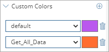
Custom Colors: To configure a color for each data point, click this option.
-
Customize Series Colors
 : To add a custom color for a data point in the component, click this button.
 A list box and color box appear. In the list, select or type a data point, and then click the color box beside it.
-
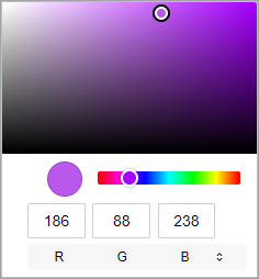
Color dialog box: Select a color or enter an RGB, a HSL, or a hex code to specify a color.
-
Default: To specify the default color for all data points, from the list, select default, click the color box, and then select a color. Any data point in the component that is not configured with a custom color displays the color configured for the default data point.
-
-
-
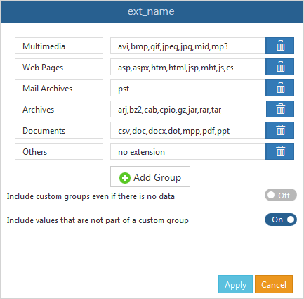
Custom Groups: To create custom data points based on the data types in the component, click this option.
-
X-axis Data: To enable custom group settings, move this toggle key to the right, and then click the edit button
 .
.The X-axis Data dialog box for custom group settings appears.
-
Add Group: To specify a custom data points, click this button.
-
Group Name: Enter a label for the data point.
-
Group Values: Enter text or a formula. You can use regular expressions to define the content.
-
Delete Group
 : To remove a custom group, click this button.
 -
Include custom groups even if there is no data: To include all of your custom groups, even if there is no data to display, move this toggle key to the right.
-
Include values that are not part of a custom group: To include all values that are not part of a custom group in a single group titled Others, move this toggle key to the right.
-
Apply: To save custom groups, click this button.
-
Cancel: To exit the dialog box without saving changes, click this button.
-
-
Custom Code
On Click
Allows you to configure an action on a bar or the entire chart using JavaScript.
Customize Legend Labels
Allows you to configure an action on the legend labels using JavaScript.