Line charts display changes in data over time. Information appears in a series of data points that are connected by lines. This type of chart is useful for displaying information that changes continuously.
Example
This image is an example of a line chart in the report builder:
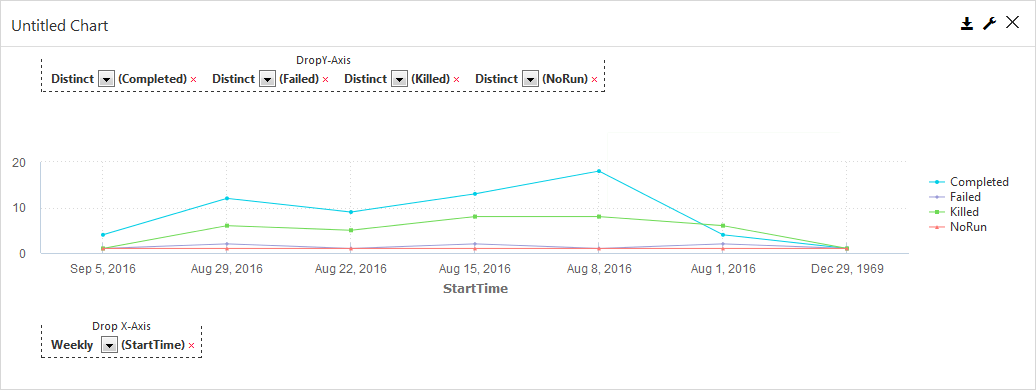
Drop Y-Axis
In a line chart, the y-axis can include both text-based or numeric categories, such as job statuses or total backup size.
Drop X-Axis
In a line chart, the x-axis includes numeric information, such as the start time for a job.
Properties
You can open the Properties dialog box by clicking Edit Properties  .
.
General
Chart Title
Allows you to specify the name of the chart.
ID
By default, displays the automatically-generated identifier for the chart. You can specify a different chart ID.
Data Set
Displays the data set used to create the chart. This box is not editable.
Y-Axis Title
Allows you to specify the label for y-axis data that runs horizontally across the bottom of the chart.
X-Axis Title
Allows you to specify the label for x-axis data that runs vertically up the side of the chart.
Chart Type
By default, displays the type of chart you chose to create. You can change the chart type by selecting another type from the list.
Look and Feel
Show Gridlines
When selected, shows the gridlines in the chart. When cleared, hides the gridlines in the chart.
Smooth Lines
When selected, displays curved lines instead of straight lines. When cleared displays straight lines.
Show Markers
When selected, displays a dot for each data point. When cleared, hides the dot for each data point.
Show Data Labels
When selected, displays the value associated with each data point. When cleared, hides the value associated with each data point.
Show Legend
When selected, displays a legend for the chart information and the Max Legend Label Length and Legend Position settings. When cleared, hides Legend information and settings.
Legend Position
Allows you to configure the placement of the legend in the chart. Can be Top, Bottom, Right or Left.
Max Legend Label Length
Allows you to configure the maximum number of characters in legend labels.
Sorting
Sort By
Data can only be sorted by the x-axis values. This setting is not editable.
Sort Order
Allows you to sort data in ascending or descending order.
Y-Axis
Legend Label
Allows you to specify a name for the legend label related to the data.
Aggregate
Allows you to specify the type of numeric value to display in the data points.
Auto convert values
When selected, automatically converts display sizes for labels. For example, 10,000 KB is converted to 10 MB.
X-Axis
Slant X-Axis Labels
When selected, displays x-axis labels at a slanted angle and allows you to specify the degree of the angle. When cleared, displays x-axis labels
Max Points
Allows you to specify the maximum number of data points that will appear in the chart.
All Points
When selected, displays all data points. When cleared, the Max Points setting controls the number of data points that appear in the chart.
Custom Colors
You can configure a color for each x-axis data point.
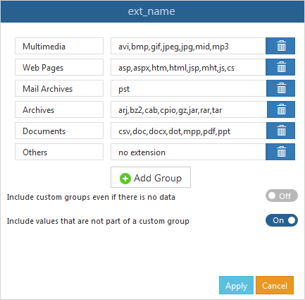
Custom Groups
You can create custom data points based on the data in each field in the chart.
Field Name Option
When selected, enables the custom group settings you configured.
Field Name Dialog Box
Allows you to specify a set of custom data points based on the text or formula that you enter. You can use regular expressions to define the content. Select a field name, and then click Edit to open this dialog box.
Custom Code
On Click
Allows you to configure an action on a bar or the entire chart using JavaScript.
Customize Legend Labels
Allows you to configure an action on the legend labels using JavaScript.