When you add a heat map component to a report, you can configure additional options.
Before You Begin
-
To build and deploy reports, your CommCell user account requires a role with the Add Report permission and an association with the CommCell entity.
For more information on users, permissions, and associations, see User Administration and Security - Overview.
Procedure
-
On the Web Console for the Private Metrics Reporting Server, click Reports.
The Worldwide Dashboard appears.
-
To open a report where you have already added a data set, from the navigation pane, click Configuration > Reports, and next to the Report Name under Actions, click Edit.
-
Optional: If your report has multiple pages, click the tab for the page that you want to edit.
-
Drag Heat Map to the Drop components to build the report box.
-
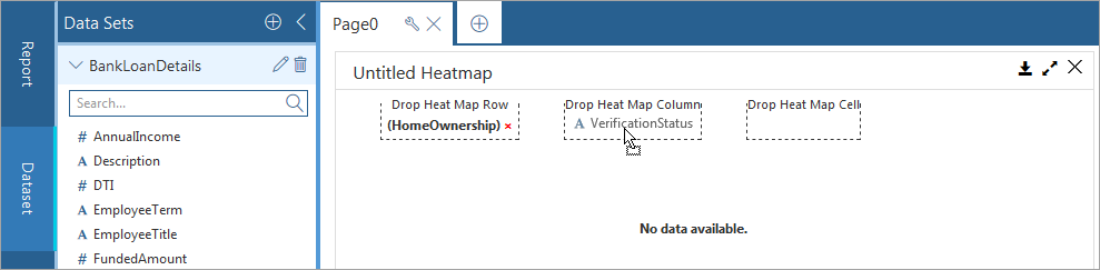
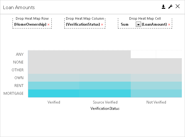
From the Data Sets list, drag field to the Drop Heat Map Row box.
-
Drag a field into the Drop Heat Map Column box.
By default, the Drop Heat Map Cell box will display a count of the field that you selected for the Drop Heat Map Column.
-
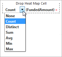
If you want to configure something other than default, delete the Drop Heat Map Cell selection, and from the Data Sets list, drag another field to the Drop Heat Map Cell box.
A drop-down list appears under Drop Heat Map Cell.
-
Select an option for the type of aggregate information that you want to display in the component.
Options vary based on the type of field that you select.
-
Select the component, on the Properties tab, click General
 , and configure any of the settings.
The following table lists the properties you can change:
Goal
Perform action under General
Enter a label for the component
In the Chart Title box, type a name for the component.
Customize the label for the Y-Axis
In the Y-Axis Title box, type a name.
Customize the label for the X-Axis
In the X-Axis Title box, type a name.
Change the type of component displayed
In the Chart Type list, selection another type of chart such as Horizontal Bar or Pie Chart.
Hide gridlines
Clear Show Gridlines.
Sort the data in ascending order
Select Toggle Chart.
Display the value associated with each bar
Select Show Data Labels. If there are too many data points to display, then the labels will be automatically sampled.
Hide the legend
Clear Show Legend.
-
On the Properties tab, click Fields
 , and configure any of the chart settings:
 -
Configure the component settings under Sorting.
The following table lists the properties you can change:
Goal
Perform action under Sorting
Sort by the X-Axis values
In the Sort By list, select X-Axis.
Sort by the Y-Axis values
In the Sort By list, select Y-Axis.
Sort in ascending order
In the Sort Order list, select Asc for ascending.
-
Configure the component settings under Measure.
The following table lists the properties you can change:
Goal
Perform action under Measure
Specify the type of numeric value to display in the columns.
In the Aggregate list, select one of the available options, such as Distinct or Avg. For the X-axis, if there are over five labels, then labels will be automatically slanted.
Automatically convert display sizes for labels.
Select Auto convert values.
For example, 10,000 KB is converted to 10 MB.
-
Configure the component settings under Dimension.
The following table lists the properties you can change:
Goal
Perform action under Dimension
Display x-axis labels at a slanted angle
Set Slant X-Axis labels to On and in the Angle box, type a value for the degree of the angle. If there are over five labels, then labels will be automatically slanted.
Specify the maximum number of values that appear in the component
Expand the Field Name, and next to Max Points, type a number.
Include all data points in the component
Set All Points to On.
-
Configure the component settings under Custom Colors:
-
Click Customize Series Colors
 .
.A list box and color box appear.
-
Select a value from the list, or type a value, if not available in the list, and then click on the box next to it.
-
In the Color dialog box, select a color, and then click OK.
-
Repeat these steps to specify a color for any value.
-
-
-
To configure settings under Custom Code
 , see Configuring Custom Code and Custom Styles for Reports.
 -
Click Close.
-
To save this version of your report specification in the Reports Manager, at the top of the Report Builder page, click Save.
-
To make the report available to end users on the Reports page, at the top of the page, click Deploy.